Usage
When to use
Use a card container to help build more consistently styled cards.
Types
Static cards
Static cards may have interactive elements within them but are not actionable or interactive on their own.
Interactive cards
Interactive cards are actionable (e.g., it can be hovered, clicked, focused, etc.)
Levels
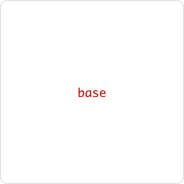
Base
Use the base level for static cards.
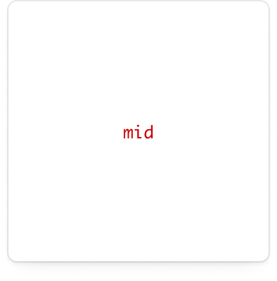
Mid
- For static cards use
midas the default level. - For interactive cards use
midas the rested state.
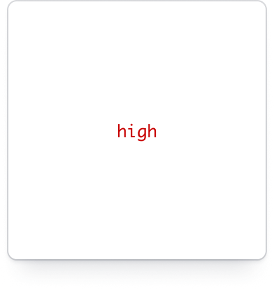
High
- For static cards use
highfor emphasis, but use sparingly. - For interactive cards use
highfor the raised state.
Border
Card containers come with or without borders.
Background
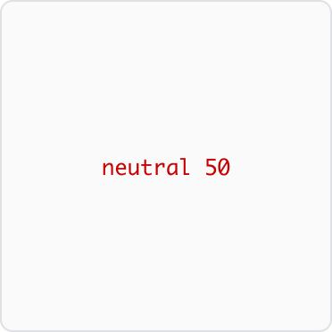
There are two backgrounds available: neutral-0 and neutral-50.
Recommended spacing
We recommend the following spacing options for cards:

- 16px all around
- 24px all around
- 16px top/bottom; 24px left/right
- 24px top/bottom; 16px left/right
How to use this component
<Hds::Card::Container @level="mid" @hasBorder=>
[Your content here]
</Hds::Card::Container>
To style the Cards, you can add an external element that wraps the Card, with a custom class that controls the width of the wrapper itself and an internal element that wraps the content and applies padding around it (resulting in visual internal padding for the Card) and aligns the text to the center.
Alternatively, you could use the Card Containers in a CSS flex or grid container.
Interactive states
At the moment, we do not recommend using the Card component as an interactive element, although we may add this feature in the future. Despite this, some products have implemented designs that provide visual feedback to the user interacting with a Card by changing the elevation style (on :hover or :active).
As a stopgap, we have introduced two specific arguments @levelHover and @levelActive to allow users to declare the specific "level" they want to use for each of these interactive states.
Component API
level
enum
- base (default)
- mid
- high
levelHover
enum
- base
- mid
- high
:hover state.
levelActive
enum
- base
- mid
- high
:active state.
background
enum
- neutral-primary (default)
- neutral-secondary
hasBorder
boolean
- false (default)
overflow
enum
- visible (default)
- hidden
…attributes
...attributes.
Conformance rating
By default, the card container component has @overflow="hidden" applied to it. This means you may need to handle cases where text is truncated, to make it accessible for keyboard-only users.
Additionally, if the component is altered to be an interactive element, and also contains interactive elements like links or buttons, it can cause a conformance failure for having nested interactive elements.
Support
If any accessibility issues have been found within this component, let us know by submitting an issue.